Raptis Rare Books Employing DNA Technology to Authenticate Books

According to the product’s creator, UK-based SelectaDNA, so-called “synthetic DNA” can help fight inventory loss and theft and has been employed in casinos, hospitals, banks, museums, and other institutions worldwide for over a decade to identify and protect valuables. Earlier this month, Raptis became the first bookseller in the United States to incorporate synthetic DNA for authentication and inventory management.


“Think of each unit of synthetic DNA as a high-tech fingerprint,” explained SelectaDNA vice president Joe Maltese. “Each application of Synthetic DNA generates a unique code, providing clients with the ability to identify and recover lost or stolen rare books. Raptis is using the technology to demonstrate their rare books have been authenticated and sold by them.”


For book collectors worried this serum might mar their treasures, fear not: the non-toxic, water-based serum is invisible to the naked eye. Applied to a book, the serum can last up to five years and has a lifespan of 4 to 6 weeks on skin–helpful to pinpoint a thief who has been inadvertently misted with a special spray, also sold as part of an alarm system by SelectaDNA. The company says their product reduces theft by 83 percent when incorporated into such an alarm system. If triggered by a burglar, the system releases a mist containing a unique DNA code and UV tracer. Shining an ultraviolet light on the suspect will reveal whether he or she purloined the goods in question.


Raptis is using the DNA Asset Marking System which is applied to books with a special stamp; the images below show Raptis is using a stamp in the shape of an “R.”


Photo #1.jpg


Photo #2.jpg


“Raptis Rare Books takes extraordinary measures to ensure authenticity of its collection of literary treasures,” said Raptis founder Matthew Raptis. “The use of SelectaDNA is an excellent complement to our rigorous authentication protocols,” he continued. “It provides our clients with added confidence in purchasing these rare literary gems.”
Images, from top: Matthew Raptis, owner and founder of Raptis Rare Books, alongside Shakespeare’s Fourth Folio, valued at $100,000. Book marked with synthetic DNA solution without use of ultraviolet light. Book marked with synthetic DNA solution and fluorescing from use of ultraviolet light. Used with permission from SelectaDNA.


This story first appeared on the Fine Books Blog on Friday, October 26, 2018.

Nick Basbanes Live on the Colin McEnroe Show

Listen to Nick Basbanes chat with WNPR’s Colin McEnroe at the following link: “Follow the Paper Trail” http://www.wnpr.org/post/following-paper-trail

Something Wicked This Way Comes: “Macbeth” Hits Stages from Coast to Coast

Could Macbeth be to Halloween what A Christmas Carol is to Noël? Based on the number performances starring the Thane of Cawdor this month, all signs seem to point to yes. Among the various renditions, Shakespeare’s tragedy exploring the darkest and bloodiest elements of human nature appears in wildly different venues on either ends of the country this month.


macbeth1.JPG


Starting October 20 and running through November 3, the Shakespeare Center of Los Angeles opens its “immersive” production of Macbeth. Directed by former Royal Shakespeare Company member Kenn Sabberton, The Tragedie of Macbeth is set in a haunted house where audience members walk through the play as it is happening. The show starts in the Shakespeare Center’s parking garage, which stands in for the mysterious witches’ heath, then winds its way through the castle. Pared down to seventy minutes with nine actors playing everyone from Macbeth to Banquo, the intimate nature of the show limits fifty spectators per performance.
In Cambridge, Massachusetts, catch a glimpse of Macbeth through the fog art installation currently set up at Harvard University’s Arnold Arboretum. Fog x Macbeth takes place on Sunday, October 21 at 5 pm, and like the Shakespeare Center’s adaptation, it is an abridged portrayal. This show is part of a larger exhibition by Japanese fog artist Fujito Nakaya, whose five fog sculptures situated in and around Boston are helping celebrate the twenty-year anniversary of the Emerald Lake Conservancy, a group dedicated to conserving the area’s century-old park system created by Frederick Law Olmstead.


macbeth2.JPG


The Actor’s Shakespeare Project  (ASP), a Boston-based theater company whose mission is to share Shakespeare’s immortal words with contemporary audiences, uses an adaptation by playwright Migdalia Cruz, whose full play is on stage now through November 11 at Brookline’s United Parish.


Meanwhile, with jets of gray mist pulsing at various intervals as the backdrop, Sunday’s free presentation will take place on the lawn next to the arboretum’s Hunnewell building. Audience members are welcome to bring lawn chairs or blankets and are encouraged to dress for the elements.


And finally, Macbeth was recently staged at a place where both actors and audience members deeply related to the characters they portrayed: Twin Rivers Correctional Institution in Umatilla, Oregon. One of the actors portraying Macbeth is currently serving life in prison for murder. (Reporter Noelle Crombie at the Oregonian goes into great detail about the performance and the organizations that bring acting programs to inmates.)


“I have done the deed” takes on new meaning, doesn’t it?


Photo credit: Nile Scott Shots

Kids Books Quick Picks

Fall always heralds the arrival of great children’s books, and this year’s crop doesn’t disappoint. Behold a few of our favorites of the season:

stanley

Stanley’s School, by William Bee, (Peachtree; $14.95, 32 pages, ages 2-5) is the latest in a series starring a charming hamster. As the title suggests, Stanley is running things at school and leads his furry charges through a typical day: from arrival to read-aloud, lunch, and dismissal, these pint-size creatures demonstrate the inner workings of pre-k and elementary school. Bee’s large, cheerful illustrations invite young readers to revel in heading to class. The padded covers invite little hands to fully explore while also signaling the transition from board books to picture books.

squirrel

In another rodent-driven narrative, Martin Jenkins’s The Squirrels’ Busy Year (illustrated by Richard Jones, Candlewick; $16.99, 32 pages, ages 3-6), introduces changing seasons and weather patterns by following a year in the lives of two inquisitive squirrels. Foraging for acorns and dodging owls are a few of the daily adventures these busy critters face, depending on the season. Straightforward and uncomplicated prose is accompanied by front matter offering specifics in case adults get peppered with a few “why” questions after a read-through. An index with follow-up questions meand to encourage further inquiry roud out this smart volume, while Richard Jones’s mixed-media renderings of the natural world are textured and comforting.

creature

National Book Award Finalist Sy Montgomery’s How to Be A Good Creature: A Memoir in Thirteen Animals (illustrated by Rebecca Green, HMH; $20.00, 208 pages, ages 7-up), examines a life spent in the company of animals and how those relationships taught her compassion, love, and forgiveness. From a family pig named Christopher Hogwood to a giant Pacific octopus named Octavia, each vignette imparts life lessons that only a non-human can provide. “Other species, when we are allowed to know and care about them, give us a chance expand our moral universe,” says the author. “We learn to embrace the Other. We have a lot in common with our fellow animals–we share about 90% of our DNA with fellow mammals, and animals from clams to elephants share our same neurotransmitters, responsible for perceptions and emotions.” Montgomery’s poetic text proves her ability to write for readers of all ages. Accompanied by author photos and Rebecca Green’s whimsical, folk-art inspired sketches, How to Be a Good Creature affirms what many of us already know: that human-animal bonds are not just real, they are powerful agents of change, acceptance, renewal. Consider reading this in tandem with your child–there’s plenty here to encourage a robust dialogue on many of life’s big questions.

Cover image: “Compulsory Education,” by Charles Burton Barber. 1890. Public Domain.

Lessons in Bad Behavior from Ancient Greece: A New Translation of “Characters” by Theophrastus

9780935112375_FC.jpg

If there’s anything new to learn from Characters, a series of personality portraits written by the ancient Greek Theophrastus (c. 371 – c. 287 BC), it is that gluttons, chatterboxes, drunks, idiots, and others are not unique to any time or place in human history.  This robust little volume of character sketches has been widely published and translated since its first appearance twenty-three centuries ago–Jean de la Bruyère’s Les Caractères (1688), Character Writings of the Seventeenth Century (1891) and the Loeb Classical Library’s edition are a few that come to mind–but each translation is an interpretative undertaking, meaning there is always a renewed need for fresh viewpoints.

On October 1, Characters will be once again published in English, this time by Callaway Arts & Entertainment. Translated by Pamela Mensch with vibrant pen-and-ink illustrations by acclaimed caricature artist André Carrillo, this edition includes insightful annotations by Bard College classics professor and Guggenheim recipient James Romm.

Part the enduring appeal of Characters is that bad behavior, however caustic, is, whether we like it or not, universal; who doesn’t know a busybody who “stands up and promises what he can’t deliver,” a slovenly fellow “afflicted with dull-white eczema and black fingernails, go[ing] about saying that these illnesses are hereditary,” and the friend of scoundrels who “fraternizes with men who have been defeated in court and convicted in public trials; he assumes that if he’s friendly with them, he’ll become more worldly and formidable.”


“These are flesh-and-blood people, with very familiar flaws and foibles,” Romm explained. “They remind us that ancient Greeks were actual human beings, not marble busts. The past no longer feels like a foreign country. It’s a true gift to be able to ‘feel’ the reality of the classical world.” As Romm points out in his introduction, some previous translators could not square with the lack of judgement in Theophrastus’s sketches and inserted their own. This edition strips away those addendums, allowing the original descriptions to be read on their own merit.


And yet, English-speakers don’t suffer for lack options: Penguin released a paperback version as recently as 2015, so why a new translation now? “There’s a very practical reason,” Romm said. “The Greek text of Characters is rather messy, with lots of sentences in dispute (or simply unintelligible) due to copyists’ errors in the transmission process. Only a few years ago, a new edition of the Greek text by James Diggle sorted out many of these problems. This new English version by Pamela Mensch takes advantage of that cleaned-up Greek text.”


Contemporary readers may be familiar with Theophrastus’s exhaustive Inquiry into Plantsand Causes of Plants. However, Characters reveals more of the author’s natural verve and wit, which has led some scholars to dispute whether Theophrastus deserves the attribution. “The contrast between Characters and the botanical works is indeed sharp,” Romm said. “Assuming Theophrastus wrote both, he seems to have wanted to take an occasional break from science to compose light satire, and perhaps, like all good teachers, sought a way to bring some levity to his ‘classroom’ — in his case, the Lyceum, founded by Aristotle.”


We may see a bit of ourselves, our friends, and our political leaders in these portraits, but how might have an ancient Athenian reacted? After all, these were sketches based on actual people Theophrastus encountered on a daily basis. Romm believes the Greeks would have taken it in stride– “With a laugh and a nod of recognition, and probably a bit of embarrassment!”

Society needs writers who document human behavior, even if that behavior never seems to change. But those records needn’t always be gloomy. “Thucydides famously wrote that human nature is constant over time, so that the deeds he recorded in the Peloponnesian War would be seen again,” Romm said. “In his case, that’s a tragic message, since he mostly records atrocities. Theophrastus supplies the comic side of the same equation.”

Theophrastus’ Characters: An Ancient Take on Bad Behavior, by James Romm, André Carrilho, and Pamela Mensch. Callaway Arts and Entertainment; $24.95, 119 pages.


This story first appeared on the Fine Books Blog on September 28, 2018.

Roald Dahl’s “Matilda” Turns 30

unnamed.jpg


“So Matilda’s strong young mind continued to grow, nurtured by the voices of all those authors who had sent their books out into the world like ships on the sea.” That quote and many others extolling the virtues of reading great books comes from Roald Dahl’s Matilda. Originally published on October 1, 1988, Dahl’s now-classic tale of a gifted girl cursed with horrible parents and a tyrannical headmistresses was an immediate success. Receiving the Children’s Book Award in 1989, becoming a major motion picture in 1996, and inspiring the 2010 musical adaptation, Matilda is perhaps Dahl’s best-selling book, with over 17 million copies in print.
Collectors should head to British rare bookseller Peter Harrington who is offering six first editions of Matilda. “In recent years, Matilda has become our top-selling book,” explained Peter Harrington’s son and current owner, Pom. “Matilda is a fabulous spirited girl and the book is loved by adults and children alike.”
Among the six copies offered for sale are two inscribed first editions, one being a presentation copy with, “To all the Briggs, with love, Roald. 9/4/88” at the front. Michael Briggs had operated on Dahl’s spine in 1978, after which the men became good friends. This copy is available for £4,000 ($5,300). The second inscribed copy, available for for £3,500 ($4,630) reads: “Camilla, love Roald Dahl.”


unnamed (1).png

Additionally, Penguin Random House will be releasing special editions of the book on October 4 with new cover images by the book’s original illustrator, Quentin Blake. Each of the three covers features a grown-up Matilda as an astrophysicist, a world traveler, and Chief Executive of the British Library. These 30th anniversary editions are available for pre-order starting at $17.99.


9780241390535_Matilda.jpg

Images: (Top and Middle) Courtesy of Peter Harrington; (Bottom) Courtesy of the British Library Shop.

Winnie-the-Pooh Wanders into the MFA Boston

04_Winnie_the_Pooh_first_edition.jpg
A.A. Milne’s Winnie the Pooh has never suffered for lack of exposure–far from it. Since the publication of Milne’s first children’s book starring a loveable, honey-hungry bear in 1926, Winnie-the-Pooh has been translated into fifty languages and been the subject of numerous films and exhibitions. Here’s one more to add to the list: on September 22nd, the Museum of Fine Arts, Boston will present nearly 200 drawings, letters, photographs, and ephemera in a show entitled, “Winnie-the-Pooh: Exploring a Classic.”
The exhibition originated in 2017 at the Victoria & Albert Museum in London where most of the items on display are part of that institution’s permanent collections. The show then made its way to the High Museum in Atlanta before setting up in Boston.

03_Print_of_Pooh_sitting_on_a_branch_with_honeypots.jpg
The goal of the show is to explore various relationships between a bear and a boy, the interplay between Milne’s text and the art of E.H. Shepard, and how classic children’s literature remains relevant in the 21st century.
Highlights include Shephard’s first character portraits of Winnie, Eeyore, Kanga, and other creatures of the Hundred Acre Wood, a 1926 handwritten letter from Milne to Shephard, and photos of Milne’s family.
The show is definitely geared towards children, and the MFA curators have installed various interactive elements, such as recreations of Pooh’s home and the childhood bedroom of Christopher Milne, the inspiration for Christopher Robin. Cuddle-worthy corners throughout the gallery invite children to read, draw, and even listen to a 1929 recording of Milne reading Winnie-the-Pooh aloud. Co-sponsored by Hood Milk, visitors who attend on opening day can enjoy games like a round of ring toss on the MFA’s Huntington Avenue lawn along with generous servings of cookies, milk, and Hoodsie  cups.
To paraphrase Pooh himself, you can’t stay in your corner of the forest waiting for this show. Check it out before it heads back to London.

“Winnie-the-Pooh: Exploring a Classic,” runs from September 22nd through January 6th, 2019 at the Museum of Fine Arts, Boston. More information at www.mfa.org.

Images, from top: Winnie-the-Pooh first edition, 1924, published in London by Methuen & Co. Ltd; printed by Jarrold & Sons Ltd.

“Pooh sitting on his branch … beside him, ten pots of honey,” 1970, Ernest Howard Shepard.

 “For the first time he learned to think before he spoke.” Johnny Tremain: A Classic Revisited

Esther Forbes’s 1944 Newbery Medal-winning story set on the eve of the Revolutionary War turns seventy-five this year. To commemorate the milestone, publisher Houghton Mifflin Harcourt recently released an updated edition with new jacket art and includes an illustrated forward by author-illustrator Nathan Hale (not the American spy executed by the British in 1776).

As riveting as ever, Johnny Tremain should be required reading for everyone, adults included. The book has never been out of print and Walt Disney turned it into a movie in 1957. Let’s not forget that Forbes also won a Pulitzer in 1942 for Paul Revere and the World He Lived In, a vivid biography of the patriot’s life based largely on his correspondence.

Forbes, for her part, was a dyed-in-the-wool New Englander and a trailblazer in her own time: born the fifth of six children to William and Harriette Forbes in Westboro, Massachusetts in 1891, she moved with her family to the county seat of Worcester, where her father practiced law. Forbes and her sisters were among the first girls to attend the private Bancroft School where, dyslexic and nearsighted, the young Forbes was once accused of plagiarism after sharing a story she had written to amuse her siblings. Undeterred, she continued to write, and at her death in 1967 was working on a book about witchcraft. The first woman to become a member of the American Antiquarian Society, Forbes left the Worcester institution the rights to her books as well as material for her unfinished final volume.

Johnny Tremain 75th Anniversary Edition, by Esther Hoskins Forbes, illustrated by Nathan Hale; Houghton Mifflin Harcourt, $14.99, 320 pages. ages 9-12. 

Bank on Booksellers Auction Funds Disaster Relief

It’s no secret that being a bookseller is hard work, but thankfully they have the book industry charitable foundation known as Binc to lean on when times are tough.  Billed as “the saftey net for booksellers,” Binc has provided more than $6 million in financial assistance and scholarships to bookseller employees since its inception in 1996. The foundation has helped with everything from paying for serious medical expenses, utilities, and even funeral costs.

As the only nonprofit dedicated to providing aid to bookstore employees, Binc is fully funded by generous supporters and is currently hosting an online auction called Bank on Booksellers.  One hundred authors, illustrators, and celebrities like Judy Blume, Katherine Applegate, Kate DiCamillo, Jeff Kinney, and Marc Brown decorated piggy banks to be auctioned off to the highest bidder. (Check out the selection here.) Ten thousand dollars have been raised so far, but the auction ends Saturday. Help Binc bring home the bacon by placing a bid at the foundation’s secure website.

image_Chris_Raschka_PB2_2

To all the booksellers and everyone else in the path of Hurricane Florence, please be safe. We are all thinking of you.

Q&A with Jennifer Morla, Designer and Subject of Forthcoming Book from Letterform Archive

MorlaDesign_DeluxeOverhead.jpg


Jennifer Morla is a legend in her own time: for forty years, her shadow has loomed over the world of graphic design. Earning over 300 accolades like the Cooper Hewitt award, the AIGA medal, and the Smithsonian Design Museum National Award, Morla’s work has graced publicity campaigns for some of the world’s best-known brands like Levi’s, Design Within Reach, Swatch, and Nordstrom. The Library of Congress and MOMA have her pieces in their permanent collections, and when she’s not running her eponymous design firm, Morla is teaching design at the California College of the Arts.


Now, Morla is the subject of a forthcoming biography being published by Letterform Archive. Entitled, fittingly, Morla: Design, the Kickstarter-funded project explores Morla’s career, her creative process, design philosophy, and also offers behind-the-scenes stories about various high profile projects. Staying true to Morla’s contemporary and lively aesthetic, the book features neon bookmark ribbons, metallic inks throughout, and a vegan leather case, itself a design triumph. Letterform’s all-or-nothing Kickstarter campaign ends Saturday, September 8, though it has already surpassed its $50,000 goal. Donations in all amounts are still very much welcome, but those willing to pledge $125 and up will receive a copy of the book.


Morla graciously answered a few questions recently about the book, the importance of listening to clients, and whether words remain as important as art in our increasingly image-saturated world.


1. Your book is the second book to be published by Letterform Archive, following on the heels of W.A. Dwiggins: A Life in Design. How did your project come about?


It seemed like the appropriate time for me to discuss my design approach and identify the issues that I consider when formulating my design process. Letterform Archive showed an immediate interest in publishing my monograph and has been a true partner in bringing this book to print.


2. You founded Morla Design in 1984. What drew you to this field?


My aunt was an editor at Condé Nast in the 60s and would occasionally cast my sister and myself in photoshoots when we were young. By the time I was 10 years old, I already had been exposed to the workings of a magazine and an in-house “art department.” Another great influence was visiting MOMA’s design wing as a child and seeing chairs, posters and books displayed in a museum.  Those events, coupled with my ability to draw, solidified my decision to become a designer.


3. What is it like to know your work will exist in perpetuity in institutions like the LIbrary of Congress and is considered a touchstone of American design?


It is very, very humbling. I consider myself so very fortunate to have had clients who have collaborated with me in defining communication goals without defining the solution.


4. Was yours an artistic household? Growing up in Manhattan, I imagine you took great advantage of your surroundings. What were (or remain) your New York design influences?


My mother was an art history major and would take us to museums often when we were young. One of my favorites was the Guggenheim, an architectural icon, so very different from any other museum in the city. I was in love with the building, and what nine year old doesn’t love skipping down a six story ramp? Another big influence was The New York Times. Type, illustrations, fashion, a magazine, and those wonderful, full page Ohrbach’s ads! In 1970, the Vietnam War was raging and political images proliferated all around the city: in the media, on construction barricades, in subway ads. Push Pin’s posters, an Evergreen magazine cover by Paul Davis of Che Guevara, the musical “Hair,” all had a profound influence on me understanding the power of design in its many forms.


MorlaDesign_Projects.jpg


5. Your first job out of college was at San Francisco’s local PBS station, followed by a move to run the art department for Levi Strauss. What was that leap like? Was it challenging going from a nonprofit to a commercial entity?


The biggest difference was design budget. Although my meager salary was the same for both positions, the Levi’s creative budget allowed me the opportunity to produce big ideas. At the PBS station, the creative budgets were so tight that I hand-cut rubylith [masking film] to save money. I handled every project from beginning to end: photography, lettering, illustration and animation. At Levi’s, I was able to hire great photographers, print thousands of posters, and create high end brochures using every specialty printing technique. Both jobs were extremely informative and gave me the confidence to open my design studio at 28 years old.


6. I’m going to ask you a question you’ve probably been asked hundreds of times: what makes good design? Does good design change with the times, or are their classic elements that never go out of style?


Great design is, quite simple, innovation that reflects the spirit of an era and becomes a classic because of its timeless appeal.


7. How has your design aesthetic evolved, if at all, over the course of your career?


Although I can see some influence of a certain time period in my work, I have always maintained that design should be appropriate to the problem rather than a stylistic conceit.  I hope the work shown in the book is a testament to that belief.


MorlaDesign_Typefaces.jpg


8. It seems our society is moving away from verbal communication towards more visual marketing and communication. Has this trend changed how you work? Or do words remain as relevant as ever?


As designers, we often underestimate the impact we have on the world at large, and how our visual vocabulary is influenced by political, social and cultural events. I created Designisms, a listing of my observations and reflections on design and designing. Specific to your question, a designism: Words are as important as images and images can be more powerful than words.


9. How do you approach a project? What’s your process?


I always start with sketching. Many sketches. The final sketches identify the solution, including typeface considerations, color, illustrative style and final form. I often consider whether the solution can be accomplished with just type.


10. Have you ever worked on a project that didn’t turn out as expected, for better or for worse?


Oh yes, I believe in allowing the process to help define the solution. And accidents are an important part of the process. Only the creator can identify when an accident, something you did not expect, adds an informative detail to the solution.


11.  Are you a collector? If so, what do you collect. And why?


Not a collector at all, I am a minimalist. But I do love to read and read about 50 books a year. I guess I collect books.


12.  What are your favorite books?


I especially like fiction and my list of favorites is vast: Orlando by Virginia Woolf, the way she shocks the reader with the unexpected, to John Updike’s uber-realistic Rabbit series. From contemporary novelists like Jenny Egan to Flaubert’s classic, Madame Bovary. When my girls were in eighth grade, I read what they were reading and I got to fall in love again with Huckleberry Finn and Pride and Prejudice. Current favorite authors beside Egan are George Saunders, Don DeLillo, Ian McEwan, Zadie Smith and for a chuckle, David Sedaris.


13. Could you talk a little about the design process for Morla: Design. It is encased in vegan white leather with a vacuum-formed cover. What do you hope the design of your book will convey to readers?


That design is not only about two dimensional space, that form can surprise and generate curiosity. I relish experimenting with materials; the vacuum-formed and debossed covers both are seductive and amplify the pattern cover art. Fluorescent inks act as chapter dividers and bring attention to the section of the book I dedicated to my best loved typefaces and characters. I utilized many of my favorite printing and binding techniques in designing the book: Fluorescent and metallic inks are used to identify my essays, vellum sheets with white ink display my “designisms”, full bleed images throughout showcase projects and the ribbon markers allow the reader to mark favorite images. The book itself is a tactile and visually rich object.


14. In addition to running Morla Design, you teach at California College of the Arts. What are some of the most common questions you receive from students about making a living as a designer?


I believe that a good designer is a great listener, and if you carefully, the client nearly always gives you the solution to the problem.


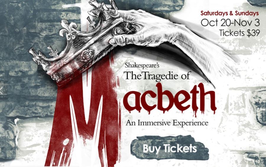
Images courtesy of Letterform Archive