Q&A with “Kama Sutra” Illustrator Victo Ngai

Just as each age has reinvented Shakespeare to suit its own time and culture, so to, it seems, that every era needs its own Kama Sutra, that ancient Hindu treatise on courtship and sexual behavior. To wit: the Folio Society recently published a limited-edition run of 750 hand-numbered copies of the 2,000-year-old instruction manual for joyous living.


007_KSL LR.jpg

This edition of Vatsyayana’s seven-part Sanskrit compendium is a blend of old and new. The text remains Sir Richard Burton’s 1963 landmark English translation but is accompanied by a specially commissioned essay by historian John Keay that explores the importance of sensuality in ancient Hindu society.
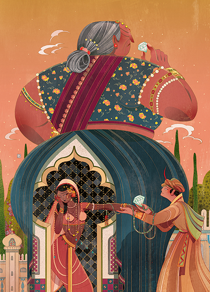
But the art is what really sets this edition apart: sumptuous illustrations by award-winning artist Victo Ngai. The work of the Hong-Kong-based RISD graduate has graced the pages of The New York Times and covers for Simon & Schuster and Random House. Here, her precise handiwork expertly captures the nuance and detail of the Kama Sutra. Interestingly, Ngai is the first woman to ever illustrate this pleasure tome, and her art presents a decidedly female focus.


005_KSL LR.jpg

We recently spoke to Ngai after her own recent nuptials and asked about this commission and the various influences that shape her work.
Were you surprised by the Folio commission?

Not really because I first suggested this book to The Folio Society’s art director Sheri Gee a few years ago after finishing our first book Chinese Fairy Tales and Fantasies together.

Did you consciously illustrate the Kama Sutra to reflect a woman’s perspective?

Frankly it hasn’t been my intention to make a “feminist’s Kama Sutra.” To me, the main objective of this project has always been to create the most lush and sumptuous volume that’s worthy of and true to this 2000-year-old Sanskrit classic. However, examining the pieces now in hindsight, I believe I did subconsciously work from a female-centric perspective by selecting subject matters which interest me and composing images which would tell the stories from the woman’s point of view.

001_bw_KSL.jpg
What was your approach to illustrating the book? How, if at all, was it different from other projects?

In many ways the process is very similar to illustrating other books- reading the book to get the big picture, rereading the book to pick out stories that catch my eye, distilling the stories into short phrases and simple ideas, translating and refining these ideas into visuals through thumb-nailing, polishing the thumbnails into sketches, creating line drawings which forms the foundation of the final images, then finally finishing the pieces with fitting colors and mood. What is unique to illustrating each book is its content as it would inform the composition, storytelling, color palettes and mark making of the arts.

Were you familiar with the Kama Sutra prior to this project?

Only as familiar as everyone else, that it’s an ancient book about sex from India.

003_bw_KSL.jpg
In the West, the Kama Sutra is commonly associated with unexpected and inventive sexual positions, but it’s really a guide to living a well-rounded life. Did anything in the book surprise you?

I was surprised by most of the book, actually. Only one chapter is dedicated to sexual union, which is what you hear mostly about. The other six chapters were a new discovery. I think the biggest surprise to me is how the book can be both patriarchic and progressively feministic at the same time. In many ways it reflects the male dominating social order of its time–that men have the (official) monopoly on polygamy and women’s well-being largely rely on their successes with men. Meanwhile the book stresses the importance for men to keep their women happy and devotes long paragraphs going into great detail on what men need to do to win and sustain a lady’s heart. However, in my opinion, the truly feministic idea appears in the chapter about courtesans. One can always argue the suggested kind gestures and tenderness towards women from other chapters are ultimately means for men to gain what they want, be it sex, love, loyalty or devotion. Whereas in this chapter, the book encourages the women to take charge of their sexuality, giving helpful tips on how to get what they want through manipulation of men, which turns the objectified into an active agency in the heterosexual relationship.

004_KSL.jpg

The 25 black and white positions illustrations are certainly erotic but not pornographic–how did you strike the right tone? When did you know you got it right?

Thank you, that’s great to hear! The figure-design was definitely one of the most challenging and time consuming process in this project. Besides the balance between eroticism and pornography, there’s also the juggle between being poetic and informative.

The first round of thumbnails was too realistic and felt like porny medical diagrams. The second round was overly expressive and looked cartoonish. The third round was excessively geometrical that took the fluidity out of the forms. I knew the sweet spot laid somewhere in between all of these unsuccessful attempts, but it still took a few more rounds to get there. What I was aiming for the final design was that the faces and bodies were generic and stylized just enough, but not much, that they can be part iconographies, which are graceful and unemotional, and part humans, which are sexy and provocative.

Were you familiar with Indian art and culture prior to this project?

I wouldn’t say I was very familiar with Indian art and culture before working on this book, but I have always had a keen interest in Hindu Mythologies, miniature paintings, and intricate and ornate patterns. One of the major reasons I wanted to work on this project was to have a proper excuse to research and learn more about this fascinating culture, while getting paid!

What do you hope readers will take away from your illustrations?

That Kama Sutra is a rich and multifaceted book, it’s not only a great window into ancient Hindi’s bedrooms and their impressive flexibility, it also paints a vivid picture of people’s daily household lives which includes making parrots talk after breakfast and bidding on cricket-fights; their religious beliefs and rituals; regional stereotypes and prejudices; social-economic construct of the time as well as tips and advises on romantic relationships which many are still surprisingly relevant today.

I understand you got married recently–congratulations! Did your work on the Kama Sutra influence your nuptials?

Thank you so much! I think the book is a great reminder that it takes work to sustain a happy and fruitful marriage, both inside and outside the bedroom.


The Kama Sutra of Vatsyayana, Illustrated by Victo Ngai, translated from the Sanscrit by Sir Richard Burton and Forster Fitzgerald Arbuthnot. Available in a limited edition of 750 copies for $595 each through the Folio Society.


All images reproduced with permission from the Folio Society. 

Medieval Academy of America Hosting Excursion to England

Looking for a reason to go to England? The Medieval Academy of America may have something just for you. This fall, it’s launching a travel program modeled on lifelong learning programs run by traditional universities, and the itinerary definitely has the Anglobibliophile in mind.

From October 23-28, Medieval Academy of America executive director Lisa Fagin Davis will be leading the five-day, four-night tour that winds through London and Oxford. Dubbed “The Anglo-Saxons: Britain before 1066,” the excursion includes a visit to Anglo-Saxon Kingdomson display at the British Museum and Tolkien: Maker of Middle-earth at the Bodleian Library in Oxford. (Be sure to read the fall issue of FB&C for a review of the Tolkien show.) This is the only week both exhibitions will be on view at the same time.

While in London, the group will take in a performance of “King Lear” with Sir Ian McKellen in the title role of one of Shakespeare’s greatest tragedies, as well as a curatorial tour of the Tolkien exhibition.

The trip costs $2,580, which includes hotel, meals, and tickets, and transportation in-country. Single-occupancy hotel rooms add $750. (Airfare not included.) All proceeds from the trip benefit Medieval Academy of America programming. Participants need not be Medieval Academy members.

The trip is limited to twenty travelers, and registration closes on August 23. See the brochure and detailed itinerary at: https://cdn.ymaws.com/www.medievalacademy.org/resource/resmgr/pdfs/MAA_Trip_to_England.pdf

Image: Anglo Saxon Mappa Mundi, c. 1025-1050. Via Wikimedia.

Exhibit on Painter William Birch at the Library Company of Philadelphia

2-13-Philadelphia History Musuem.jpg

William Birch’s paint box, ca. 1780. Courtesy of the Philadelphia History Museum at the
Atwater Kent, The Historical Society of Pennsylvania Collection.


Conjure an image of early America, and Federal-era architecture, bustling shipyards and streets, and bucolic farm scenes probably come to mind. Whether most of us realize it or not, much of how we view that era was created by William Birch (1755-1834), a London transplant whose work became synonymous with the time when a young nation was full of hope and optimism.


2-15 Philadelphia Museum of Art.jpg

William Birch. Portrait of George Washington, 1796. Enamel on copper. Philadelphia
Museum of Art. Gift of the McNeil Americana Collection.
Now through October 5, the Library Company of Philadelphia is showcasing Birch’s paintings, including never-displayed manuscripts, enamels, and other pieces illustrating Philadelphia during the nineteenth century when it was the capital of America.


4-5-birch-p-2276-33.jpg

William Birch, Second Street North from Market St. w[i]th Christ Church, (Philadelphia, W. Birch),1827-1828. Hand-colored engraving. Library Company of Philadelphia.
“The exhibition tells the story of Birch’s entire life from his early years in England to his death in Philadelphia,” explained the Library Company’s prints and photographs curator Sarah J. Weatherwax. “It also explores the influence Birch’s work had on Philadelphia iconography long after his death. While many people are aware of Birch’s views of Philadelphia, few know much about his work as an enamel painter or his aspiration of being a landscape architect, themes that are examined in the exhibition.”
Considered America’s first “coffee table book,” Birch’s now-iconic The City of Philadelphia (1800) showed a civilized city and helped bolster early national pride. It was also a commercial success. “The City of Philadelphia showed Philadelphia as the cultural, economic, and political capital of the newly formed United States,” Weatherwax said. “Here, between the Schuylkill and Delaware Rivers was a city where important institutions flourished, where businesses prospered, and where the inhabitants carried out their activities of daily lives. The engravings are large, colorful (if you paid to have them hand-colored), and engaging.”
Meanwhile, Birch’s follow-up book, Country Seats, was less successful. “The views in Birch’s Country Seats are much smaller in size and appear rather lifeless,” explained Weatherwax. “Nor is there a built-in audience for scenes of a wealthy gentleman’s country estate in the same way that views of city’s street life would have. Also, Americans of the period tended to think of the countryside as the location for agricultural endeavors or other practical uses, not the rural retreats Birch portrayed.” Though Country Seats met a tepid response, Birch knew his work held importance beyond what his contemporaries thought. In his autobiography, Birch wrote that his book was “the only work of its kind yet published.” Little could he have realized the historical record his achievements would provide over two hundred years later.
Birch is considered to be one of the first commercially successful artists in America, and his work remains as relevant as ever, even if the places he painted are drastically changed. “Birch’s views of Philadelphia provide us with our most comprehensive documentation of an 18th century American city and continue to be the cornerstone of how we represent a late 18th century urban space,” said Weatherwax.
Approximately 100 items from the Library Company of Philadelphia’s collection are on display, including material loaned from other institutions and private collectors. Highlights include Birch’s private copy of the Country Seats with a notation stating, “intended to be continued but no encouragement,” two ceramic vases made by the Tucker Factory of Philadelphia decorated with views from Birch’s Country Seats, a watercolor sketch of Birch’s country estate, and a copper engraving plate used for City of Philadelphia.
The Library Company’s director Michael Barsanti likened Birch’s portraits to America’s baby pictures, and that “they show the strength and promise of our country as it appeared in its earliest days. They also show what we looked like through the eyes of a new immigrant, who saw a contrast between its vitality and undeveloped natural beauty and the England he left behind.”


More information on the exhibition here.

Featured Image: John Neagle, Portrait of William Birch, 1824. Oil on canvas. Private Collection.

The Future is Female: How A.N. Devers Is Balancing the Bookshelves

Whether or not the name of A.N. Devers’s bookstore The Second Shelf plays on French existentialist Simone de Beauvoir’s landmark treatise on feminist philosophy The Second Sex, her endeavor certainly stems from a similar desire for equality—in this case, to balance the bookshelves for men and women writers.

Read my story about Devers and her quest over at the Book and Paper blog.

Closing Soon: Exhibition on Immigration at Houghton Through August 18

image006.jpg

Planning a visit to Cambridge, MA, in the coming weeks? If so, be sure to check out an exhibition at Harvard’s Houghton Library addressing the very hot topics of immigration, DACA, asylum, and travel bans. Passports: Lives in Transit is in its final weeks, and library curators are inviting the public to examine passports, visas, and travel documents hailing from Harvard Library collections, as well as an installation of expired passports. Featured famous migrants include Leon Trotsky, George Balanchine, and others.

JC_Passports-6.jpg
On August 10, the library is hosting a closing celebration from 4:30pm to 7pm. First up is a panel discussion and Q & A with speakers from Harvard’s Administrative Fellowship Program. Hosted by Anne-Marie Eze, Houghton’s director of scholarly and public programs, panel participants will discuss “Global Mobility: Identity, Migration, and Passports.”

From 5:30pm to 7pm, visitors are invited to the Mama Africa Party in the Houghton Library’s Edison and Newman room. Billed as a “cross cultural celebration of humanity’s common roots,” live music will be performed by Afro-pop musician Albino Mbie, dancing performed by Angie Egea, and food provided by Suya Joint All African Cuisine.
Though free to the public, RSVPs are requested to ensure enough food and drink for all:
http://houghton75.org/?event=passports-lives-in-transit-closing-event


Image credits:
Albino Mbie/Courtesy of Shuhei Teshima.

Angie Egea/Courtesy of Carven Boursiquot

Shirley Graham Du Bois’ African Passports: Ghana, 1963 and Tanzania, 1972. Schlesinger Library, Radcliffe Institute, Papers of Shirley Graham Du Bois, 1865-1998, MC 476.

Understanding Vernacular Photography: Collecting Found Photos

We’ve all been there: perhaps it’s been during an intense cleaning session of grandma’s attic, or after a box or two fall from an already overstuffed closet shelf. There it is, a shoebox full of old photos. We pause from whatever task we’re doing and open the box to explore the contents within. Who are these people? What are they wearing? Why are so many out of focus? Well, congratulations, dear reader, because you’ve just been hit with a trove of vernacular photos, and they’re all the rage in the collecting world right now.

Ok, so what makes a “vernacular” photo? Read the rest at A New Look at Old Books, a new biblio blog we’re writing for and hosted by Book & Paper Fairs.

Image courtesy of Stacy Waldman


Abby and Jack Review Two New Children’s Books

Abigail is back, this time with her friend Jack to review two new children’s picture books. Jack tackles Zachariah Ohora’s latest fuzzy caper involving a pair of apartment-dwelling felines, while Abby looks at a canine compare-and-contrast board book by French illustrator Élo. Both are great choices for early readers to enjoy during the dog (and cat) days of summer.

Niblet & Ralph, by Zachariah Ohora, Dial Books for Young Readers; $17.99, 32 pages, ages 2-6. 

Niblet and Ralph is about two cats and their kid owners. The four of them live in the same building, but only two of them know it. A tragic mystery happens that brings the humans together–be sure to read the book to find out! The cover shows a cat wearing headphones–how adorable!

9780735227910

N&R p24-25

N&R p16-17.jpg

Images reproduced with permission from Dial Books.

Contrary Dogs, by Élo, Candlewick Studio; $12.00, 20 pages, ages 0-6. 

Contrary Dogs is a funny book about all different types of dogs–opposites, really. For example, one has spots, another doesn’t. Plus, it’s a book where you can lift the tabs–who doesn’t like those? Your child will love exploring the tabs and reading all about these amazing dogs!

contrary dogs

9781536200621 (1)

9781536200621.jpg

CONTRARY DOGS. Copyright © 2016 by Éditions Sarbacane. Reproduced by permission of the publisher, Candlewick Press, Somerville, MA on behalf of Walker Books, London.

Little Women at 150: Louisa May Alcott’s famous novel never gets old

My story on the 150th anniversary of Little Women is the June e-feature at Fine Books and Collections

Source: Literary Anniversary – Fine Books and Collections

Words and Meaning: A Look at Exhibit Design

A recent trip to the Worcester Art Museum (WAM) to inspect, among other items, a panel painting newly attributed to Leonardo da Vinci, revealed a curatorial trend of removing informational wall panels and captions. This captionless experiment was being played out in the museum’s Renaissance and Old Masters galleries.

 
“The Museum is working on alternative design approaches that encourage new ways for visitors to interact with and participate in daily uses of the gallery,” reads the WAM website. In Worcester’s Renaissance gallery, informative text has been replaced by interactive iPads and laminated guides stored in hanging bins around the room.

 
As a museum-goer accustomed to informative text, the absence was jarring–is the portrait on the wall a Vermeer or a Rembrandt? To answer that required firing up the communal electronic device or hoping the plastic info sheets weren’t missing. The experience brought up the question of whether or not informative captions distract from artistic enjoyment and contemplation.


Captions have become something of a controversial topic in the museum world, for reasons ranging from misleading facts to funding concerns to pleasing everyone in an age of political correctness. In a 2015 ArtNews article, WAM director Matthias Waschek expressed great pleasure at removing “that damn piece of paper,” referring to wall labels, allowing works of art to speak for themselves. Yet for those without a degree in art history, properly constructed captions provide welcome nuance and context.

 
“I guess I’m old fashioned,” said Brazilian art historian, curator, and collector Pedro Corrêa do Lago recently when asked about his preference for informative captions. Corrêa do Lago has amassed over 100,000 autographs, manuscripts, and other handwritten items that span nearly a millennium and which are now subject of a new exhibition at the Morgan Library. The Magic of Handwriting: The Pedro Correa do Lago Collectionshowcases 140 jewels from his archives that bear the signatures and handwriting by a who’s who of the world’s creators, performers, and thinkers. (See Nick Basbanes’s forthcoming profile on Corrêa do Lago in the next issue of FB&C.)

 
Corrêa do Lago wanted viewers to enjoy the exhibition at hand while also understanding the rationale behind the inclusion of each piece. How then, to tie together material hailing from six distinct disciplines in the Morgan’s intimate Engelhard Gallery? To do this, he turned to Brazilian husband-and-wife team Daniela Thomas and Felipe Tassara, the duo responsible for designing the Rio 2016 Olympic Opening Ceremony. At the Morgan, Thomas and Tassara organized the items like rows of cream-white Greek stele; each autograph sheet is raised at an angle, as if on a writing desk, protected only by a thin film of plexiglass, while large-font informative text greets the viewer at eye level. The result is a wholly immersive and informative experience.

 
“The text is critical,” explained Thomas. “It explains why Pedro selected these specific pieces, and how the power of handwriting can connect us to great people.”


Unaccompanied by captions, however, a letter bearing the thumbprint signature of physicist Stephen Hawking or other slips of paper become no more than marks on a page.


hand2.JPG

New for 2019: Booklyn Art Fair and a New Location

In a positive sign of the times, we’re pleased to report the forthcoming arrival of another new book arts fair. Booklyn, that beloved Brooklyn institution dedicated to promoting book artists, printers, and other bibliocentric pursuits, is getting into the book fair business. In September 2019, Booklyn will be joining forces with the New York City Book and Ephemera Fair, also affectionately known as the Satellite Fair that takes place the same weekend as the annual New York Antiquarian Book Fair, and they’ve put out a call for exhibitors. Here are the specifics:


Booklyn has forty tables available to exhibitors for the duration of the two-day show at the bargain price of $400 each, limit four tables per artist, group, organization, or press. Contact mweber@booklyn.org to reserve a table before the September 1 deadline. The Fair itself will take place Saturday, March 9, 2019, 8:00 AM to 4:00 PM, and Sunday, March 10, 2019, 9:00 AM to 3:00 PM at Sheraton Central Park 811 7th Avenue New York, NY, 10019.


The theme for the 2019 fair is a bit of a mouthful, but certainly gets the point across: “Resistance and Resonance, how have the recent Art Build, Me Too, March for Our Lives, Black Lives Matter, BDS, Immigrants’ Rights, Gender Justice, and Standing Rock direct action movements affected the field of creative publishing?” Participants are invited to submit a proposal for a presentation based on that theme.


Bookyln organizers hope this new endeavor will provide participants the opportunity to meet new audiences and collectors in Manhattan.


In addition to launching a new fair, Booklyn’s in some new digs: the organization recently moved to a location in the Artbuilt Brooklyn center located in the Brooklyn Army Terminal (Building B-7G) and will reopen to the public in July with a welcoming exhibition, workshops, and lectures. The telephone number remains (718) 383-9621.