
(via A Moveable Feast Tops French Bestseller Lists – The Fine Books Blog)
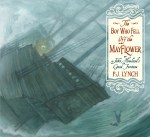
The Boy Who Fell Off the Mayflower, or John Howland’s Good Fortune, by P.J. Lynch; Candlewick Press, $17.99, 64 pages, ages 7-10.
Here’s a Thanksgiving story that fully examines the adventure, faith, luck, and unity that defined the Pilgrims’ early days in America. Award-winning author and illustrator P.J. Lynch’s latest children’s book focuses on the life of John Howland (c.1591-1672), an indentured servant who sailed aboard the Mayflower and eventually became the executive assistant to John Carver, New Plymouth County’s first governor. Told in the first person, the fictionalized account of Howland’s crossing takes on a dramatic sense of urgency–England’s Separatist church members (they weren’t pilgrims yet) were being jailed and harassed, and though they had found religious asylum in Holland, church members feared a war with Spain would again put their community in peril.
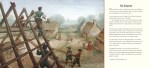
Lynch details a journey that seems doomed from the get-go (the Mayflower’s sister ship, the Speedwell, never even crossed the Atlantic), and at times it looks like the group won’t make it. (Re-read the title. Howland actually fell off the Mayflower during a storm. That historical nugget inspired Lynch to write the book.) Though originally headed for Virginia, fierce storms bobbled the ship two hundred miles off course, to Cape Cod, where the weary travelers set ashore, where another adventure of survival awaited. Lynch’s gouache paintings expertly capture both the squalor of London and the wilderness of New England. (This is the first book Lynch has both written and illustrated.) Samoset, Squanto, and the great Wampanoag sachem Massasoit are also richly rendered, highlighting the peace these groups enjoyed throughout Howland’s long life. The feast scene is particularly warm, especially after reading about the unforgiving first winter. (Nearly half the settlers died, and lodgings were little more than canvas stretched wooden frames.) The Boy Who Fell Off the Mayflower also provides surprisingly relevant food for thought in our current debates over refugees seeking religious asylum. The author’s notes and bibliography offer further resources for learning more about this pivotal moment in history.


Coralie Bickford-Smith is the design mastermind behind many of the stunning covers of Penguin’s clothbound Hardcover Classics series. Now, she has written and illustrated her own book, The Fox and The Star (Penguin Books Hardcover Original; $20.00, published November 10), a timeless tale of an unlikely friendship and courage in the face of hardship.
The book’s production values are exquisite–printed in Italy on creamy, uncoated, Munken Pure Rough paper and bound with bright orange thread, Bickford-Smith’s intricate designs recall the work of English textile designer William Morris. The Fox and The Star has all the trappings of a modern classic, the result of Bickford-Smith’s unrelenting quest for perfection. It is a delight to behold and to read.
Bickford-Smith spoke with me recently about writing and illustrating her own story, and how the process of putting the book together was as important as the words that fill the pages.
How did you come up with the story?
The story had been in my mind’s eye for a number years and the dream was always to make it into a book when the time was right. I wanted to distil my own experiences of life, lessons that I have learnt, into a simple story. I like the idea of turning life’s tough times into beauty.
Could you talk about the design process for The Fox and The Star?
(I imagine foil-stamping on cloth boards posed its own set of challenges.)
After the basic storyline had been agreed on, I had to get it to fit into the required amount of pages, decide how to illustrate it to create tension and pace as the book was read. Then it was about drawing and sketching out ideas for page layouts and creating dummies of the book. The process was a constant back and forth to see what should be improved, words were changed right up until the last minute before printing. As I did all my own design and art working it was an immensely involved process. The cover foiling was perfectly reproduced, we worked with the most amazing printer and this was the one area in which I knew I could be certain of producing well. My biggest battle was with my own self-confidence about whether I could produce something worth reading.
What was different (if anything) about designing and illustrating your own book?
It was a big departure for me to create an entire book instead of just visualizing and housing an author’s words, so everything felt different. I had never created a narrative visually or told a story through my illustration. For book covers I usually create symbolic elements and pattern to create a sense of the narrative contained within a book. The same skill set can seen see throughout pages of The Fox and The Star but I didn’t want to rely too heavily on this. A story needs to be told and narrated not just decorated. There was a lot to learn and consider. It was exciting to have a totally new challenge. I know that there is still much for me to learn about storytelling.
You studied Typography and Graphic Communication at Reading University. What drew you to the art of arranging type and the world of book design?
I had always been drawn to this area of creativity. Obsessed by books from a young age, constantly drawing my own type faces. It was not until I went to Reading University for my interview that I really felt that there was a place in the world for me to fit into. All my passions suddenly made sense and I was happy to be surrounded by like-minded people. It was instantly apparent that I absolutely had to study at Reading.
Your Penguin Hardcover Classic Clothbounds are considered by many to be modern collectibles. Where do you find your inspiration?
Much of my inspiration comes from looking backwards in history. Design rules are timeless. William Morris, William Blake, Rockwell Kent, Edmund Dulac and Audrey Beardsley are big influences, to name a few. This inspiration also naturally fed into The Fox and The Star. I was so eager to do an entire book from start to finish. I love the craftsmanship from the arts and crafts movement. Everything had meaning and was created with passion for the medium used. I feel that today we are becoming more and more separated from the process of creating. I want my work to be as lovingly considered as the words inside.
What was your medium for illustrating the interiors?
All my ideas come to me by drawing on paper. When something strikes me as exciting, I draw it to scale and use coloring pencils to create energy and excitement. I draw and draw until I get things right and then I take it into the computer so that it can be colored and made ready for press. I loved the fact that I controlled every aspect of the process. From writing to the drawing to the intricacies of file separation for the plates that go on to the printing press to print the right colors.
The paper stock is lovely – did you have a say in selecting it?
Yes, that paper is lovely. It is my favorite paper stock – Munken Pure Rough. I had a say in all the materials used to produce the book, right down to the orange thread that was used to sew the pages together. How the book was produced was as important to me as the story. I was lucky to be working with people that appreciate how important these elements of book design are to me.
What are you working on now?
After my time away from my Penguin day job, working on The Fox and The Star, I am once again knee-deep in Penguin classic fiction cover design. Its a bit of a treat to be back in my comfort zone again but I have a new story that is bouncing around my head so I really must start entering the zone of the unknown again.

Paris dans mon cœur
How do adults address this weekend’s carnage in Paris? (Do we?) How much information have our youngest ones already heard, and how much of it do they actually understand? Forbes magazine, France 24, and plenty of other outlets are devoting columns to the topic, where the general consensus among psychologists is not to discuss it (or any other such atrocities) with children under age six. Children attending elementary school will likely hear rumors on the playground or teachers discussing it in class, and parents should prepare for a conversation. In light of media over-saturation, parents will find themselves decoding and filtering information, and should avoid projecting their own anxieties and fears. Easier said than done, but providing reassurance is crucial. It is so easy for a child to see traumatizing images without context, and the images coming out of Paris are frightening–places children visit, like soccer stadiums and restaurants, have been turned into scenes of devastation and death. Parents and educators must be willing to “prendre la relève” or take up the burden, of providing strength and love in such uncertain times.
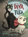
But for the littlest ones, why not spark a lifelong love for this beautiful city and its people by offering them The Story of Diva and Flea, by power-duo Mo Willems and Tony DiTerlizzi (Hyperion Press; $14.99, October 2015). It’s a story about an unexpected friendship, but at it’s core, this is a love song to Paris. Willems realized a lifelong dream of living in the city while writing the book, and DiTerlizzi’s illustrations remind us that the people, places, and creatures of Paris are beautiful, strong, and resilient. Vive Paris.

The Comedy of Physics
How Machines Work: Zoo Break! by David Macaulay; DK Books, $19.99, 30 pages, ages 6-10.
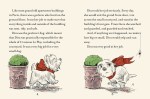
A sloth and his rodent pal Sengi are attractions at the zoo, but one fateful day they decide their enclosure too boring. They hatch an escape plan, employing simple machines like a wedge, a lever, and a pulley. Will the critter successfully catapult themselves to freedom, or will they remain forever behind bars? David Macaulay continues to dominate the world of elaborate show-and-tells in this latest volume by expertly combining witty storytelling, sly humor, and smart science. Jemma Watson’s paper mechanisms bring Macaulay’s drawings to life, and the entire cover is a working gear, the manipulation of which either saves or sinks Sloth into a piranha-filled pond. Zoo Break! is an excellent introduction to Macaulay’s world, with plenty of simple machines to encourage scientific inquiry and motor-skill practice.
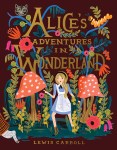
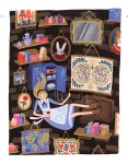
Alice in Wonderland continues to receive the red-carpet treatment, and Puffin Books recently published a 150th anniversary edition with illustrations by artist and Rifle Paper Company founder Anna Bond. In 2014, Bond illustrated Penguin’s reissues of Anne of Green Gables, A Little Princess, Little Women and Heidi and brings her whimsical, instantly recognizable style to Alice and her Wonderland cohorts. This edition would make a wonderful gift for Alice fans and design enthusiasts who may be more familiar with Bond’s stationery and gift business.
The busy new mother spoke with me recently about tackling the book, her work process, and her plans for the future.
1. What drew you to Alice in Wonderland?
Alice is not only a
classic but it’s also one of the most fantastical stories. I was drawn
to being part of something iconic. This project totally allowed
me to be creative with the illustrations.
2. Did you read the story as a child?
I never
read the book or even saw the original Disney movie as a child. Even
so, I knew so many things about the story just because it’s one of the
most beloved books – the characters are so
prevalent in our culture too. However, I read the book before I started any of the
design process. I was surprised by how funny it is.
3. How did you choose which scenes to illustrate?
I worked with Puffin
Books to decide which scenes would be illustrated as well as whether
they would be full pages, spreads or spot illustrations. We wanted to be
sure that the iconic scenes were illustrated
larger, and that each chapter had a mix of styles. There ended up being
some sort of illustration on nearly every page.
4. What’s your
medium? Could you talk a little about your design/artistic process? Were
you involved in selecting the type and font?
I paint with gouache
on watercolor paper and then scan and edit the illustrations on the
computer (for color corrections, moving things around, and so on). For
this project I rough-sketched every illustration
with pencil before I began painting to be sure I was on the same page
as the publisher. I then worked with their team to make sure the
interior was matching my vision. I couldn’t find a font for the chapter
titles and drop caps that I really felt matched
the story so I ended up hand-painting an alphabet.
5. After 150 years, there have been plenty of variations in art for the book; what’s it like tackling such a legacy?
It was both exciting
and challenging. I love the original illustrations by John Tenniel so
much, especially because they were created with input from the author.
I think they are Lewis Carroll’s vision and nothing
will replace them, but I loved the opportunity to create my own spin.
The originals were printed in black and white
so I felt like I had a great opportunity to showcase my use of color.
6. From a design
perspective, it looks like you’ve taken the whimsical approach to
illustrating Alice, very much in the vein of your work at Rifle Paper
Company. Do you see the story as a charming trip down
the rabbit hole? (I’ve spoken with illustrators who see nothing but a
tripped-out nightmare in Alice, and illustrated it accordingly.)
It definitely reads
like a dream but I personally don’t consider it a nightmare. Alice is
strong and witty and fearless. I think that saying it’s a nightmare is
discrediting her character, because she navigates
that world in such a beautiful way as she rolls through each scene.
Wild things happen all around her, but just like in dreams, they seem like reality. I tried to create a beautiful, magical world where the
imagery doesn’t necessarily always fit what’s happening
around her.
7. Your Alice is a
blond in a blue dress. Are you referencing Disney’s version from the
1950s? If so, what made you go this route? (If not, what was your
inspiration?)
Disney solidified the
blue dress as Alice’s look and I think now it’s become so iconic that I
felt like it was too risky to change. However, I wanted to make her a
little more modern and less girly. I think
she has a bit of an edge to her, so I made her hair more natural, put
her in strong button-up boots, and made her dress more simple. The story
was written in the Victorian era so I kept the pinafore, the dress
style and boots.
8. Your artwork for
Rifle Paper is impeccably curated, and though many pieces are unique,
they all have a distinct and cohesive look. How would you describe your
artistic aesthetic?
Thank you! I work
hard to create a cohesive look for the brand. It’s whimsical, timeless,
and has a distinctively vibrant color palette. Everything is painted
with gouache which gives it a vibrant and velvety
look.
9. Do you have any designers or artists you reference in your work?
I’ve been inspired by
so many artists and designers over the years. I tend to be drawn to
very bold and colorful illustrators such as [longtime Disney illustrator] Mary Blair but overall, I am drawn to
very clean, minimal and muted design. I like
to think that my work has a bit of both of those aspects to it. It’s
bold and playful but also refined. I’m always striving
for that balance.
10. You recently
welcomed a baby boy into your family. Do you think you’ll illustrate
more children’s books now? Are you working on any such projects?
It’s possible. I’ve
collected children’s books for years and always thought I would love to
write and illustrate one someday. Right now I’m working on lots of new
products for Rifle Paper Co. that go beyond
paper. I’m really excited about what’s to come over the next year or
two.
11. What kinds of children’s books do you collect?
I
have a lot of classics such as the Babar series as
well as a range books where I simply love the illustrations. However, I think most of the books in my collection were published in the ‘50s and ’60s.
Alice in Wonderland, by Lewis Carroll, illustrated by Anna Bond; Puffin Books, $30.00, 192 pages, ages 10 and up.


Staying in the Lines
Coloring books have reached the zenith of sophisticated stress-release and mindfulness for adults – one need look no further than the pricey pattern tablets offered with creamy Faber-Castel colored pencils – but coloring books for kids offer inexpensive, portable, and decidedly screen-free ways to relax and pass the time. The following three selections are the best of the pack:
I Heart Cute Coloring, by Jess Bradley; Price, Stern, Sloan, $9.99, 128 pages, ages 6-9.
Yes, this chunky tablet delivers exactly what the title promises: page after page of unicorns, reindeer and bathing penguins. The vaguely anime style lend the book an air of cool no pre-tween can resist. Rather than swipe your kid’s copy, adults can pick up the companion volume, I Heart Coloring, by Felicity French.
Merry Christmas, Hello Kitty! Grossett & Dunlap, $9.99, ages 3 and up.
64 pages of puzzles, mazes, seek and finds, and a pull-out poster all starring the global phenomenon Hello Kitty. Does it matter that the illustrations are Christmas-themed? Not in the least. If you have more than one Hello Kitty fan at home, better get two copies.
Harry Potter Coloring Book, Scholastic; $15.99, ages 9-14. (release date: November 10, 2015)
This coloring book cast a spell on me; filled with all the magical creatures and places from the film series, it will enchant Harry Potter buffs, too. The final 16 page spread includes fully-colored illustrations of emblems as well as photo stills from all the movies. Aparecium!